
Overview
Overview
OFF SCRIPT is a fictional countryside creative retreat. I designed its identity and a scroll-driven landing page where an orange paper card breaks a grid and opens into a door. It is a self-initiated concept: creative direction and design by me, imagery generated in Magnific, code built with Claude Code, GSAP ScrollTrigger (scroll animation).
The challenge
Retreat brands all look warm and handmade, and AI tools drift toward the same average. The audience, burned-out designers and freelancers, wants "a change of scenery that helps me feel inspired again." The page had to explain the offer in seconds, make Make, Connect, and Reset easy to tell apart, and work on mobile.
The idea: scroll out of routine
A bright orange sheet of paper interrupts a black-and-white grid, unfolds into a door, and opens onto a sunlit countryside barn where photography, print, graphic design, and campaign work share one roof. Orange is the only saturated colour, so it always reads as the interruption. I dropped my first idea, a print factory, because burned-out creatives need calm, not another loft.
Strategy: write the rules before using the tool
Before generating any image I wrote a rules sheet: colours, one barn, soft morning light, a banned list, and an eight-point scorecard. Every AI output had to score 7 of 8, and I logged each rejection.
Identity: a wordmark that goes off script, and a system built from paper
I explored six wordmarks and chose Literally off script: OFF in heavy type beside Script in handwriting.
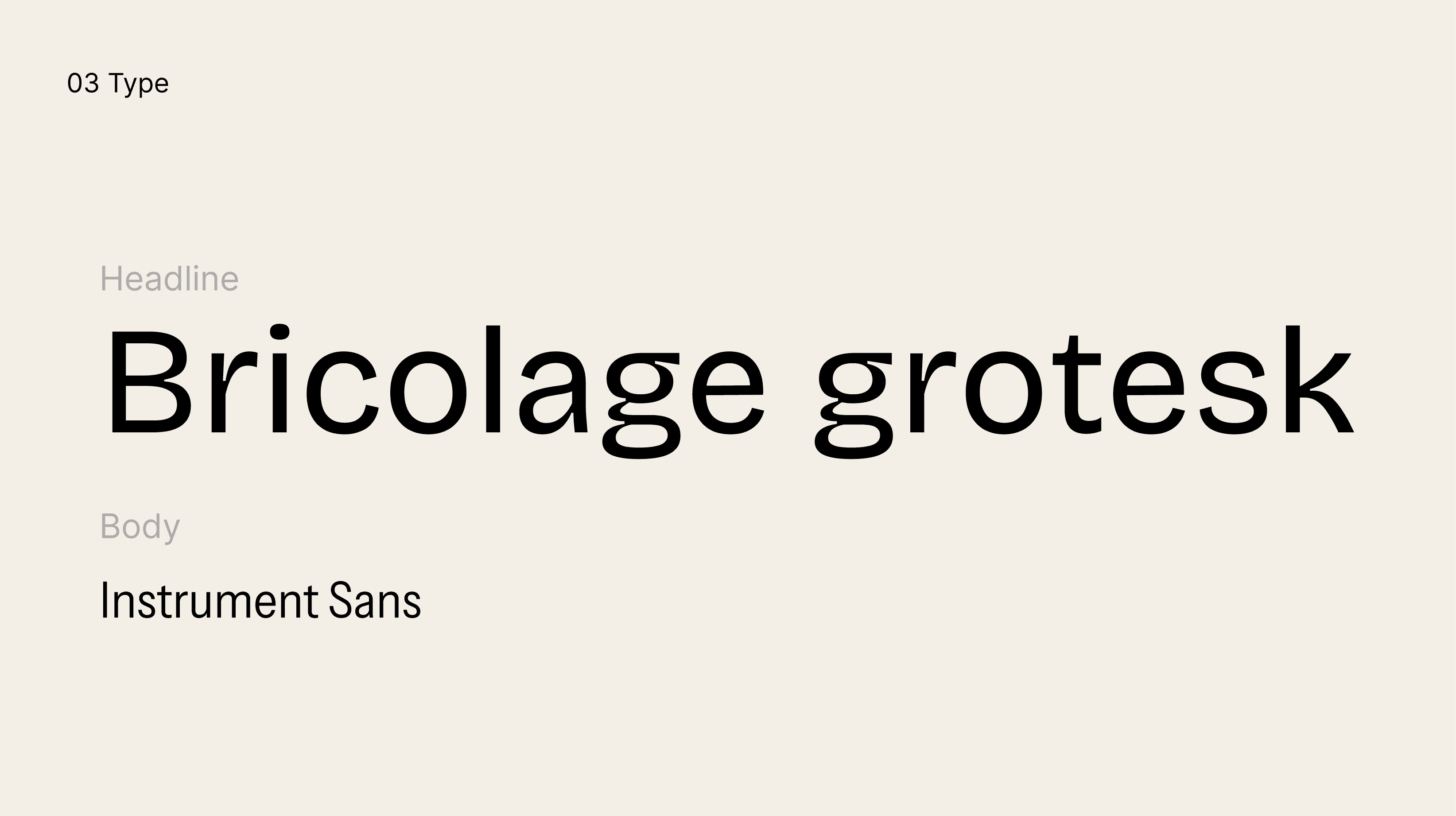
Headlines use Bricolage Grotesque and body text uses Instrument Sans. The graphic system is four paper shapes (fold, door, folded-corner frame, orange sheet), each with one rule and all tilted at 8°.
Art direction: guiding AI away from the average
I generated one hero image of the barn first and used it as the reference for every other scene, so the building stayed the same. Each scene got four variants and a score. When the discovery image looked washed out and its subject sat off-centre, I rewrote the prompt as a symmetrical, one-point perspective with natural exposure.
The experience, chapter by chapter
Five chapters, with the orange paper in each: a still grid and headline; a card that creases and swings open as a door you walk through; the barn discovered; Make. Connect. Reset. on orange, shrinking into a tag as four studios step through; and a closing invitation, Explore the retreat.
Building it with Claude Code, and where I stepped in
I gave Claude Code a folder of rules, a storyboard, SVG shapes, and fonts, then worked in small, tested steps. The first door transition felt wrong, so I had the photo stay full size behind a growing window. A pixelated hero image turned out to be my own over-compression, which I fixed with larger, multi-size images.
Making it work for everyone
Mobile layouts, a reduced-motion version that tells the same story as static sections, and accessibility basics (real h1, alt text, skip link, focus states, contrast) were designed alongside the desktop page.
Creative Direction / Branding
/
UX/UI
/
AI Assisted
2026



Result
What I learned, and what I would do next
The design work was in the rules, not the prompts. AI explored quickly and wrote code from precise direction, but consistency and feel needed my eye on a real phone. Next: ambient loops, tappable studios, and testing with real designers.
